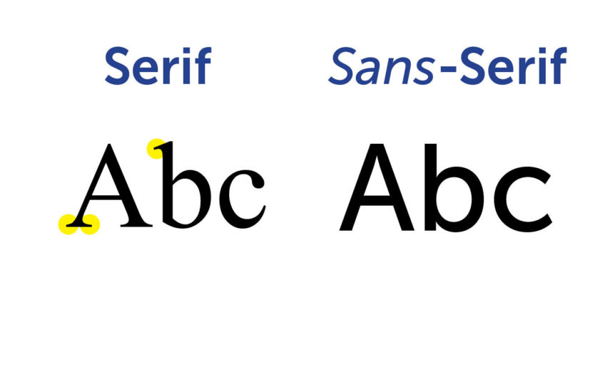
In the graphic, I highlighted the actual “serifs” on the serif typeface so you can see the physical difference between the two.
OVERVIEW
In the world of typography, a “serif” is a tiny line attached to the end of a stroke (point to point line segment) in a letter or symbol. A typeface with serifs is called a “serif typeface“. A typeface without serifs is called “sans serif”, or sans-serif, thanks to the French sans, means “without”. Therefore sans serif translates to “without tiny lines”. Sometimes you will here someone refer to a sans-serif typeface as “Grotesque” or “Gothic”. Serif typefaces can be referred to as “Roman”.
HISTORY
Serifs began in the Latin alphabet with inscriptional lettering—words carved into stone in Roman classical time. A man by the name of Father Edward Catich offered, in his 1968 book The Origin of the Serif, how broadly, but not universally accepted the serif. In his book he states “Roman letter outlines were first painted onto stone, and the stone carvers followed the brush marks which flared at stroke ends and corners, creating serifs.” On the other hand, another theory is that serifs were devised to neaten the ends of lines as they were chiseled into stone. The one theory that hits home with NER, is that many of the first books written were done by hand. That being said, the serif typeface was meant for typewriters and/or printers to mimic that of handwriting.
READABILITY
Why is serif typeface used so often in large pieces of text? Well, they are considered easier on the eye to read as the serifs quietly give your eyes a guide to go from one letter to the next with more ease. A gentleman by the name of Colin Wheildon, who conducted scientific studies in 1982–1990, discovered that sans serif fonts created various difficulties for readers that challenged clear understanding. Due to the basic constraint of screen resolution—typically 100 pixels per inch or less—the serifs in some fonts can be difficult to discern on screen.